In a world where the interconnectedness of Indigenous Peoples and Local Communities is more vital than ever, the Global Alliance of Territorial Communities (GATC) has embarked on a transformative journey to redefine its identity. Over the course of a year-long process, our organisation has carefully crafted a new brand that encapsulates the spirit of unity, resilience, and unwavering dedication to the defence of our rights and territories.
Unity in Multiplicity: The Essence of Our Brand
The process of crafting a visual identity that could encapsulate the richness of cultures present within the Global Alliance of Territorial Communities was a formidable challenge. Our aim was to create a logo and visual ecosystem that not only celebrated the diversity of our members but also symbolised the united front we present in safeguarding our shared Earth. Our member organisations come from all of the richest rainforests and all have a rich cultural heritage, but in the face of difference we come together with a shared mission.
The journey began with an extensive research phase, during which we immersed ourselves in the histories, stories, and aspirations of the Indigenous Peoples and Local Communities that constitute our alliance. Through dialogue with our leadership, we sought inspiration and meaning that would resonate deeply with our collective ethos. Each iteration of the design was a step towards capturing the intricate tapestry of our unity.
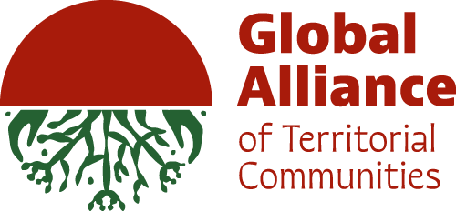
The meaning behind the logo
- The Circle: A symbol of life’s cyclical nature, the circle embodies our profound respect for Earth’s rhythms. We honour both times of abundance and rest, nurturing the planet as it nurtures us.
- The Rising Sun: The half sun represents dawn and hope. In an era marked by the climate crisis, maintaining hope for a brighter future is pivotal to our collective mission.
- Seeds: These seeds encapsulate our legacy. Our work is driven by the desire to leave a fertile planet for generations yet to come, ensuring our contributions resonate through time.
- Roots, Branches, and Corals: The intricate elements below represent our territories in their variety. They represent the roots and branches of vast forests, and also the deep sea corals of our coastal communities. For us roots represent our deep connection to our territories. We are committed to working with the grassroots organisations to ensure we are a legitimate actor to raise the voice of indigenous peoples and local communities. The roots also speak to us about our ancestral connections, we hear the voices from our ancestors and proudly carry our cultural heritage.
- Hands: Representing our connection to Earth, these hands simultaneously embrace our roots and cradle our growing branches. They symbolize our past, our present, and the growth that lies ahead.
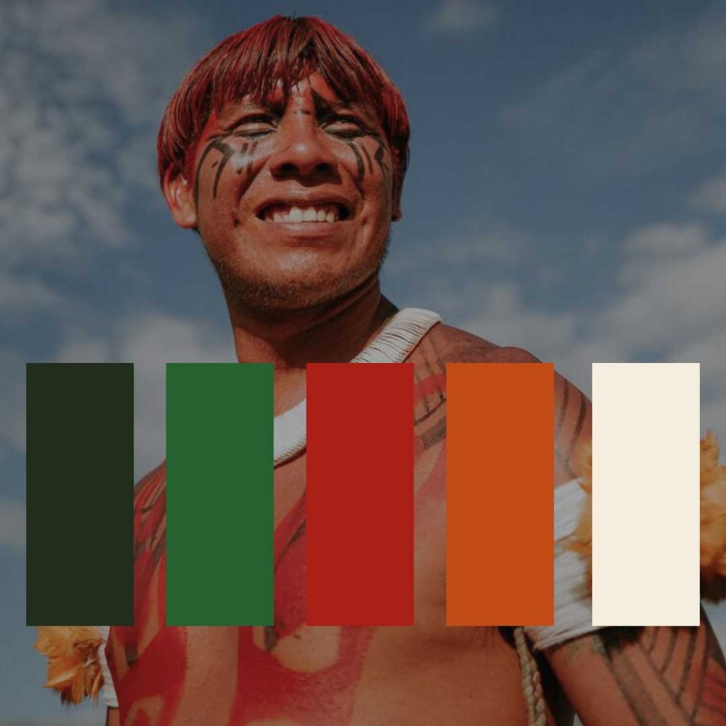
Our palette
- Deep Green: Symbolic of the profound depths of nature, this colour envelops us in the power of the natural world.
- Vibrant Green: Reflecting the abundant richness of nature, this shade encompasses all that sustains life.
- Deep Red: As the colour of blood, knowledge, and rituals, deep red signifies the collective essence of our peoples.
- Orange: Representing the soil, the source of life, orange embodies the earthy foundation that supports growth.
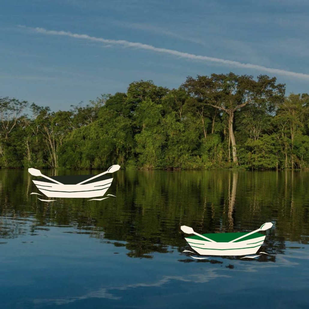
- Ivory: This hue reflects the purity and luminosity of water, which flows through our rivers and oceans, connecting us all.


In our new visual identity, we’ve woven the stories, hopes, and aspirations of us, the Indigenous Peoples and Local Communities that are guarding the future of our Earth. It stands as a testament to our unity, our growth, and our commitment to safeguarding Mother Earth. Each element of our logo carries deep symbolism, a reflection of the diverse voices and perspectives that constitute the Global Alliance of Territorial Communities. Together, we rise, we defend, and we stand as guardians of our shared home.
We extend our sincerest appreciation to Motora, the Brazilian design studio that partnered with us in this journey, they have brought our vision to life.

